Indonesia’s public bank company (2024)
Scheduled Transfer
Automates recurring transfers for bills, savings, or scheduled payments.

- My Role
- UX Writer
- Platform
- Mobile
- Category
- Banking
- Timeline
- 2024 - 2025
wondr by BNI: Content Architecture & Edge-Case Logic for Scheduled Transfers
Scheduled recurring payments are critical for digital banking engagement, but they present complex calendar and compliance edge cases, such as processing batch times, short months (e.g., February 31st fallbacks), and account balance rules.
Working as the Senior UX Writing Consultant via Accenture Indonesia, I designed the content strategy, interactive guidance, and edge-case copy architecture for wondr by BNI (2M+ downloads within 1.5 months of launch).
My role & scope:UX Writer & Content Strategist
Platform: iOS & Android mobile banking
Scope: End-to-end setup flow, progressive disclosure patterns, date fallback logic, and Figma design system copy tokens
Cross-functional Partners: Product managers, UI/UX designers, UX researchers, mobile engineers, QA, and risk & compliance leads
The challenge
The feature involved several rules that could affect whether a transfer was processed successfully:
- Transfers were processed at 00:00 WIB on the scheduled date
- Users needed to have enough balance before processing
- A transfer could fail because of insufficient balance
- Months do not always contain the same number of days
- A transfer scheduled for the 31st needed a fallback in shorter months
- The starting and ending months defined how long the schedule remained active
Displaying every detail upfront could make the feature feel more complicated than necessary. Hiding the information could lead to incorrect expectations or failed transfers.
The main content challenge was deciding which information needed to stay visible and which could be placed behind additional guidance.
The strategy
To address these issues, I focused on making the content more actionable, contextual, and easier to scan on mobile devices.
1. Explain the system before users commit
I treated the information card as part of the setup, not as a general disclaimer.
The card highlights the conditions most likely to affect the transfer:
- When the transfer will be processed
- Why users need sufficient balance
- What happens when a selected date does not exist in a particular month
This gives users information while they can still adjust their selections, rather than explaining the rules after something goes wrong.
2. Keep the task separate from the explanation
The main fields focus on what users need to do:
- Choose a frequency
- Choose a transfer date
- Choose the starting month
- Choose the ending month
Supporting rules appear in a separate information card. This prevents lengthy explanations from competing with the main task.
The Read More link provides another layer for less common rules, allowing the main screen to remain scannable while keeping further information available.
3. Distinguish the transfer date from the schedule period
The transfer date and the month range serve different purposes:
- The transfer date determines when the recurring action happens
- The starting and ending months determine how long the schedule remains active
I used separate pickers so users could make each decision independently. The modal titles also describe the specific action, such as choosing a date, starting month, or ending month.
This distinction matters because combining all the date information into one control could make users confuse the monthly transfer date with the schedule duration.
4. Write for calendar exceptions
Recurring transfers create edge cases that do not appear in one-time transfers.
For example, a user may choose the 31st, but the next month may only have 30 days or fewer. The content explains that the transfer will be processed on the final day of that month.
This rule needed to be explained before users activated the schedule. Otherwise, a correctly processed transfer could still feel like an error because it happened on a different date from the one selected.
5. Turn the completed state into a review step
Once the fields are completed, the screen presents the schedule as a readable summary:
- Monthly frequency
- Every fifth day of the month
- Start month
- End month
- Total number of transfers
The completed state is not only a form with filled fields. It acts as a checkpoint where users can verify the schedule before continuing.
Showing the total number of transfers also helps users understand the effect of the selected month range without calculating it themselves.
Key writing decisions
Use task-based labels
Labels such as Frequency, Transfer date, Start month, and End month help users understand what they are choosing.
Put rules near the setup
The information card appears on the same screen as the schedule fields so users do not need to remember instructions from another page.
Use progressive disclosure
The screen surfaces the most important rules while allowing users to open additional information when needed.
Make the completed values readable
Instead of showing only a number, the completed state uses language such as Every 5th of the month, which is easier to understand when reviewing the schedule.
Keep terminology consistent
Terms for frequency, date, start month, and end month need to remain consistent across fields, picker titles, summaries, and confirmation screens.
Screen walkthrough
Choosing the transfer frequency
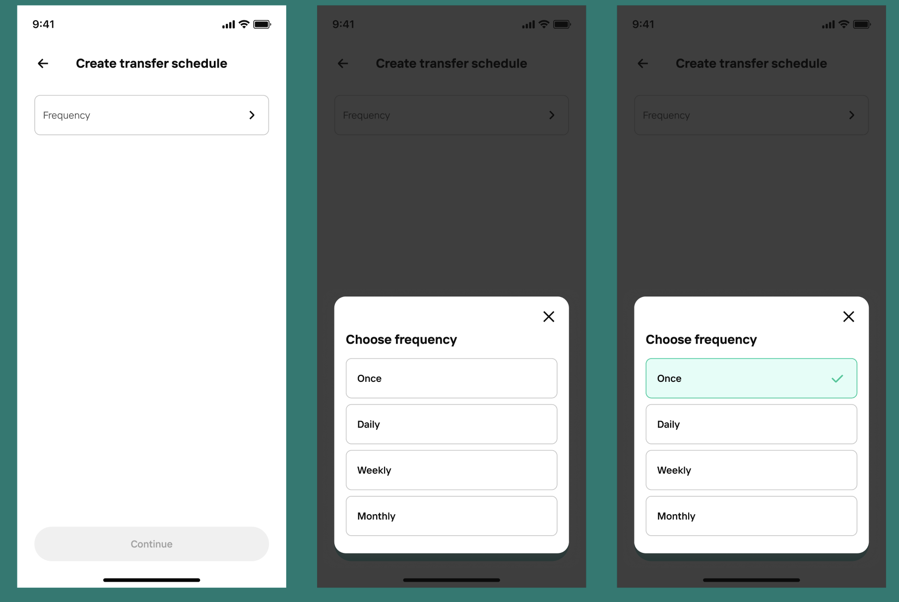
These screens show the frequency selection flow, where the user chooses how often the transfer will happen. In this example, Once is selected.
What the copy is doing
- Uses a clear modal title so users know what decision they are making
- Lists the frequency options in a simple, scannable format
- Highlights the selected option clearly, so the chosen state is easy to confirm
- Keeps the interaction straightforward and low effort
Why it matters
Frequency is the first key decision in the flow. The content needs to make the options feel obvious and easy to compare, so users can choose confidently without second-guessing what each option means.
Showing scheduled transfer information
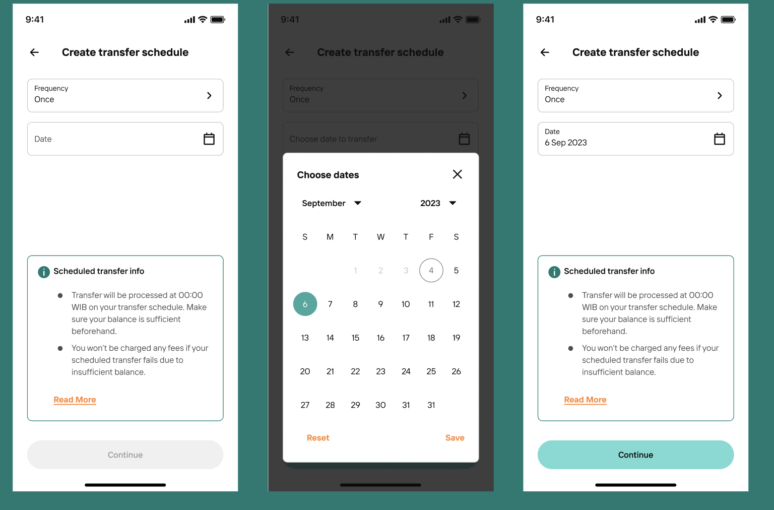
These screens show the setup page with the scheduled transfer information card visible while the user is selecting a transfer date.
What the copy is doing
- Surfaces important rules before the user confirms the schedule
- Explains key conditions such as processing time and balance requirements
- Keeps the information accessible without interrupting the main task
- Uses a secondary link for users who want more detail
Why it matters
This information helps prevent misunderstanding early in the journey. Instead of leaving users to discover the rules later, the content gives them context while they are still making decisions.
The outcome
The final content made the scheduled transfer rules easier to understand throughout the setup process.
Users could see:
- When their transfer would be processed
- Why they needed sufficient balance
- How the schedule period worked
- What would happen in months without the selected date
- How many transfers the schedule would create
- What they were agreeing to before continuing
The flow became more predictable because the content connected the user’s selections with the way the banking system would process them.
I do not have verified behavioural metrics for this individual flow, so I would avoid claiming a measured reduction in failed transfers or abandonment. The supported impact is stronger clarity, earlier guidance, and fewer opportunities for avoidable misunderstanding.
The main trade-off
- The screen needed to explain important financial rules without making the setup feel like a terms-and-conditions page.
- Keeping all the information visible would increase cognitive load. Hiding too much behind Read More could cause users to miss important conditions.
- The final hierarchy kept the most important processing, balance, and calendar rules visible, while reserving less common details for expanded guidance.